
In diesem Blog-Post zeige ich dir, wie du dein eigenes Gauge-Control mit SkiaSharp für deine .NET MAUI-Anwendung erstellen kannst.
SkiaSharp ist eine Open-Source 2D-Grafikbibliothek, die von Googles Skia Graphics Engine unterstützt wird. Sie bietet eine umfassende und effiziente API zum Zeichnen und Bearbeiten von Grafiken auf mehreren Plattformen.
Öffne Visual Studio und erstelle eine neue .NET MAUI-Anwendung. Öffne den NuGet-Paket-Manager und aktualisiere alle NuGet-Pakete, um sicherzustellen, dass dein Projekt die neuesten Abhängigkeiten verwendet. Installiere das NuGet-Paket SkiaSharp.Views.Maui.Control. In meinem Fall verwende ich die neueste stabile Version, die zum Zeitpunkt der Erstellung dieses Beitrags 2.88.8 ist.
Um das Paket zu installieren, kannst du die GUI des NuGet-Paket-Managers verwenden oder den folgenden Befehl in der Paket-Manager-Konsole ausführen:
Install-Package SkiaSharp.Views.Maui.Controls -Version 2.88.8Dies fügt deinem Projekt die notwendigen SkiaSharp-Bibliotheken hinzu, sodass du mit der Erstellung deines Gauge-Controls beginnen kannst.
Öffne nun die Datei MauiProgram.cs und füge den Aufruf .UseSkiaSharp() zur builder-Eigenschaft hinzu.
Erstelle einen neuen Ordner namens Controls. In diesem Ordner fügen wir eine neue Klasse namens GaugeView hinzu.
Beginnen wir mit dem Hinzufügen der Basisstruktur der Datei. Zuerst definieren wir einige Konstanten, die später in unserer Klasse verwendet werden.
public class GaugeView : SKCanvasView
{
    // Define the duration of the animation in milliseconds
    private const int AnimationDuration = 250;

    // Define the sweep angle for each segment of the gauge
    private const float SweepAngle = 67.5f;

    // Define the number of steps per frame for the animation
    private const int StepsPerFrame = AnimationDuration / 16;

    // Define the minimum and maximum values for the gauge
    private const float MinValue = 0f;
    private const float MaxValue = 100f;

    // Current animated value of the gauge needle
    private float _animatedValue;

    // Flag to indicate if an animation is in progress
    private bool _isAnimating;

    // MORE CODE TO ADD HERE
}
Als nächstes fügen wir den Konstruktor hinzu, den wir verwenden, um eine Standardbreite und -höhe für unser Control festzulegen.
/// <summary>
///     Initializes a new instance of the <see cref="GaugeView"/> class.
/// </summary>
public GaugeView()
{
    WidthRequest = 500;
    HeightRequest = 500;
}
Der Benutzer sollte einige Eigenschaften aktualisieren können. Daher spezifizieren wir einige Bindable Properties für unsere GaugeView-Klasse.
/// <summary>
///     Identifies the Value bindable property.
/// </summary>
public static readonly BindableProperty ValueProperty
    = BindableProperty.Create(
        nameof(Value),
        typeof(float),
        typeof(GaugeView),
        0.0f,
        propertyChanged: OnValueChanged);

/// <summary>
/// Gets or sets the value displayed by the gauge.
/// </summary>
public float Value
{
    get => (float)GetValue(ValueProperty);
    set => SetValue(ValueProperty, Math.Clamp(value, MinValue, MaxValue));
}

/// <summary>
/// Identifies the TextColor bindable property.
/// </summary>
public static readonly BindableProperty TextColorProperty
    = BindableProperty.Create(
        nameof(TextColor),
        typeof(Color),
        typeof(GaugeView),
        Colors.Black);

/// <summary>
/// Gets or sets the color of the text displayed on the gauge.
/// </summary>
public Color TextColor
{
    get => (Color)GetValue(TextColorProperty);
    set => SetValue(TextColorProperty, value);
}

/// <summary>
/// Identifies the NeedleColor bindable property.
/// </summary>
public static readonly BindableProperty NeedleColorProperty
    = BindableProperty.Create(
        nameof(NeedleColor),
        typeof(Color),
        typeof(GaugeView),
        Colors.Black);

/// <summary>
/// Gets or sets the color of the gauge needle.
/// </summary>
public Color NeedleColor
{
    get => (Color)GetValue(NeedleColorProperty);
    set => SetValue(NeedleColorProperty, value);
}

/// <summary>
/// Identifies the NeedleScrewColor bindable property.
/// </summary>
public static readonly BindableProperty NeedleScrewColorProperty
    = BindableProperty.Create(
        nameof(NeedleScrewColor),
        typeof(Color),
        typeof(GaugeView),
        Colors.DarkGray);

/// <summary>
/// Gets or sets the color of the needle screw.
/// </summary>
public Color NeedleScrewColor
{
    get => (Color)GetValue(NeedleScrewColorProperty);
    set => SetValue(NeedleScrewColorProperty, value);
}

/// <summary>
/// Identifies the Unit bindable property.
/// </summary>
public static readonly BindableProperty UnitProperty
    = BindableProperty.Create(
        nameof(Unit),
        typeof(string),
        typeof(GaugeView),
        string.Empty);

/// <summary>
/// Gets or sets the unit of measurement displayed on the gauge.
/// </summary>
public string Unit
{
    get => (string)GetValue(UnitProperty);
    set => SetValue(UnitProperty, value);
}

/// <summary>
/// Identifies the ValueFontSize bindable property.
/// </summary>
public static readonly BindableProperty ValueFontSizeProperty
    = BindableProperty.Create(
        nameof(ValueFontSize),
        typeof(float),
        typeof(GaugeView),
        33.0f);

/// <summary>
/// Gets or sets the font size of the value text displayed on the gauge.
/// </summary>
public float ValueFontSize
{
    get => (float)GetValue(ValueFontSizeProperty);
    set => SetValue(ValueFontSizeProperty, value);
}
Da wir SKCanvasView als Basistyp verwenden, müssen wir die Methode OnPaintSurface überschreiben. Diese Methode wird zum Zeichnen unseres Controls verwendet.
/// <summary>
///     Called when the surface needs to be painted.
/// </summary>
/// <param name="e">The event arguments.</param>
protected override void OnPaintSurface(
    SKPaintSurfaceEventArgs e)
{
    base.OnPaintSurface(e);

    SKCanvas canvas = e.Surface.Canvas;
    canvas.Clear();

    float width = e.Info.Width;
    float height = e.Info.Height;
    float size = Math.Min(width, height);

    float centerX = width / 2;
    float centerY = height / 2;

    float scale = size / 210f;

    canvas.Translate(centerX, centerY);
    canvas.Scale(scale);

    DrawBackground(canvas, size);
    DrawGauge(canvas);
    DrawNeedle(canvas, _animatedValue);
    DrawNeedleScrew(canvas);
    DrawValueText(canvas);
}
Schließlich müssen wir unsere verschiedenen Zeichnungsmethoden implementieren. Beginnen wir mit der Methode DrawBackground, die in der Lage ist, den transparenten Hintergrund unseres Controls zu zeichnen.
/// <summary>
///     Draws the background of the gauge.
/// </summary>
/// <param name="canvas">The canvas to draw on.</param>
/// <param name="size">The size of the canvas.</param>
private static void DrawBackground(
    SKCanvas canvas,
    float size)
{
    canvas.DrawRect(new SKRect(-size / 2, -size / 2, size / 2, size / 2),
        new SKPaint
        {
            Style = SKPaintStyle.Fill,
            Color = SKColors.Transparent,
        });
}
Als nächstes implementieren wir die Methode DrawGauge, die die verschiedenen Segmente des Controls zeichnet.
/// <summary>
///     Draws the gauge on the canvas.
/// </summary>
/// <param name="canvas">The canvas to draw on.</param>
private static void DrawGauge(
    SKCanvas canvas)
{
    SKRect rect = new(-100, -100, 100, 100);
    rect.Inflate(-10, -10);

    DrawArc(canvas, rect, 135, SweepAngle, SKColors.DarkGray);
    DrawArc(canvas, rect, 202.5f, SweepAngle, SKColors.LightGray);
    DrawArc(canvas, rect, 270, SweepAngle, SKColors.DarkGray);
    DrawArc(canvas, rect, 337.5f, SweepAngle, SKColors.LightGray);
}

/// <summary>
///     Draws an arc on the canvas.
/// </summary>
/// <param name="canvas">The canvas to draw on.</param>
/// <param name="rect">The rectangle bounding the arc.</param>
/// <param name="startAngle">The starting angle of the arc.</param>
/// <param name="sweepAngle">The sweep angle of the arc.</param>
/// <param name="color">The color of the arc.</param>
private static void DrawArc(
    SKCanvas canvas,
    SKRect rect,
    float startAngle,
    float sweepAngle,
    SKColor color)
{
    using SKPath path = new();

    path.AddArc(rect, startAngle, sweepAngle);

    canvas.DrawPath(path, new SKPaint
    {
        IsAntialias = true,
        Style = SKPaintStyle.Stroke,
        Color = color,
        StrokeWidth = 10
    });
}
Konzentrieren wir uns nun auf das Zeichnen der Nadel und der Schraube für das Gauge. Diese Elemente sind entscheidend, um den aktuellen Wert auf dem Gauge darzustellen.
/// <summary>
///     Draws the needle of the gauge.
/// </summary>
/// <param name="canvas">The canvas to draw on.</param>
/// <param name="value">The value represented by the needle.</param>
private void DrawNeedle(
    SKCanvas canvas,
    float value)
{
    float angle = -135f + value / 100 * 270f;
    canvas.Save();
    canvas.RotateDegrees(angle);

    SKPaint paint = new()
    {
        IsAntialias = true,
        Color = NeedleColor.ToSKColor()
    };

    SKPath needlePath = new();
    needlePath.MoveTo(0, -76);
    needlePath.LineTo(-6, 0);
    needlePath.LineTo(6, 0);
    needlePath.Close();

    canvas.DrawPath(needlePath, paint);
    canvas.Restore();
}


/// <summary>
///     Draws the screw at the center of the needle.
/// </summary>
/// <param name="canvas">The canvas to draw on.</param>
private void DrawNeedleScrew(
    SKCanvas canvas)
{
    canvas.DrawCircle(0, 0, 10, new SKPaint
    {
        IsAntialias = true,
        Style = SKPaintStyle.Fill,
        Color = NeedleScrewColor.ToSKColor()
    });
}
Jetzt implementieren wir die Methoden, um Text im Gauge-Control anzuzeigen. Diese Methoden sind für das Zeichnen der Beschriftungen oder Werte auf dem Gauge verantwortlich.
/// <summary>
///     Draws the value text and unit text on the gauge.
/// </summary>
/// <param name="canvas">The canvas to draw on.</param>
private void DrawValueText(
    SKCanvas canvas)
{
    SKPaint textPaint = new()
    {
        IsAntialias = true,
        Color = TextColor.ToSKColor(),
        TextSize = 12f
    };

    DrawUnitText(canvas, Unit, 95, textPaint);

    textPaint.TextSize = ValueFontSize;
    DrawUnitText(canvas, _animatedValue.ToString("F2"), 85, textPaint);
}

/// <summary>
///     Draws a unit text on the canvas.
/// </summary>
/// <param name="canvas">The canvas to draw on.</param>
/// <param name="text">The text to draw.</param>
/// <param name="y">The y-coordinate of the text.</param>
/// <param name="paint">The paint to use for drawing the text.</param>
private static void DrawUnitText(
    SKCanvas canvas,
    string text,
    float y,
    SKPaint paint)
{
    SKRect textBounds = new();
    paint.MeasureText(text, ref textBounds);
    canvas.DrawText(text, -textBounds.MidX, y - textBounds.Height, paint);
}
Schließlich müssen wir die Methoden OnValueChanged und AnimateNeedleAsync implementieren. Diese Methoden werden verwendet, um die Nadel auf den aktuellen Wert zu animieren.
/// <summary>
///     Called when the value property changes.
/// </summary>
/// <param name="bindable">The bindable object.</param>
/// <param name="oldValue">The old value.</param>
/// <param name="newValue">The new value.</param>
private static async void OnValueChanged(
    BindableObject bindable,
    object oldValue,
    object newValue)
{
    if (bindable is GaugeView gaugeView)
    {
        await gaugeView.AnimateNeedleAsync((float)newValue);
    }
}

/// <summary>
///     Animates the needle to a new value.
/// </summary>
/// <param name="toValue">The new value to animate to.</param>
private async Task AnimateNeedleAsync(
    float toValue)
{
    if (_isAnimating)
    {
        return;
    }

    _isAnimating = true;

    float stepSize = (toValue - _animatedValue) / StepsPerFrame;
    for (int i = 0; i < StepsPerFrame; i++)
    {
        _animatedValue += stepSize;
        InvalidateSurface();
        await Task.Delay(16);
    }

    _animatedValue = toValue;
    InvalidateSurface();
    _isAnimating = false;
}
Jetzt sind wir bereit, unser benutzerdefiniertes Gauge-Control zu verwenden. Dazu müssen wir die MainPage öffnen, alle vorhandenen Controls und die Logik im Code-Behind entfernen, unser Controls-Namespace hinzufügen und dann Schaltflächen zum Erhöhen und Verringern des Wertes des Gauge-Controls sowie das Gauge-Control selbst hinzufügen.
<?xml version="1.0" encoding="utf-8" ?>
<ContentPage xmlns="http://schemas.microsoft.com/dotnet/2021/maui"
             xmlns:x="http://schemas.microsoft.com/winfx/2009/xaml"
             xmlns:controls="clr-namespace:GaugeControl.Controls"
             x:Class="SevenSegmentsMAUI.MainPage">

    <VerticalStackLayout Padding="30,0"
                         Spacing="25">
        <Button Text="Decrement"
                Clicked="OnDecrementClicked" />

        <Button Text="Increment"
                Clicked="OnIncrementClicked" />

        <controls:GaugeView x:Name="GaugeView"
                            Unit="My Unit"
                            NeedleColor="Black"
                            TextColor="Black" />
    </VerticalStackLayout>

</ContentPage>
Um die Erhöhungs- und Verringerungsaktionen für unser Gauge-Control zu handhaben, müssen wir Klick-Ereignishandler für die Schaltflächen in der Code-Behind-Datei der MainPage hinzufügen.
private void OnIncrementClicked(object sender, EventArgs e)
{
GaugeView.Value += 10;
}
private void OnDecrementClicked(object sender, EventArgs e)
{
GaugeView.Value -= 10;
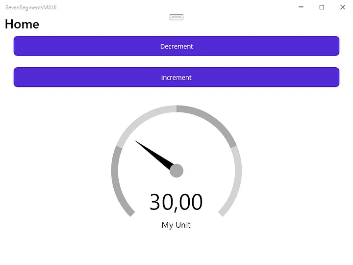
}Hier ist ein Screenshot unseres Gauge-Controls, das auf einem Windows-Rechner läuft. Das Control verfügt über eine Nadel, die sich als Reaktion auf die Wertänderungen bewegt, die durch die Schaltflächen zum Erhöhen und Verringern ausgelöst werden.
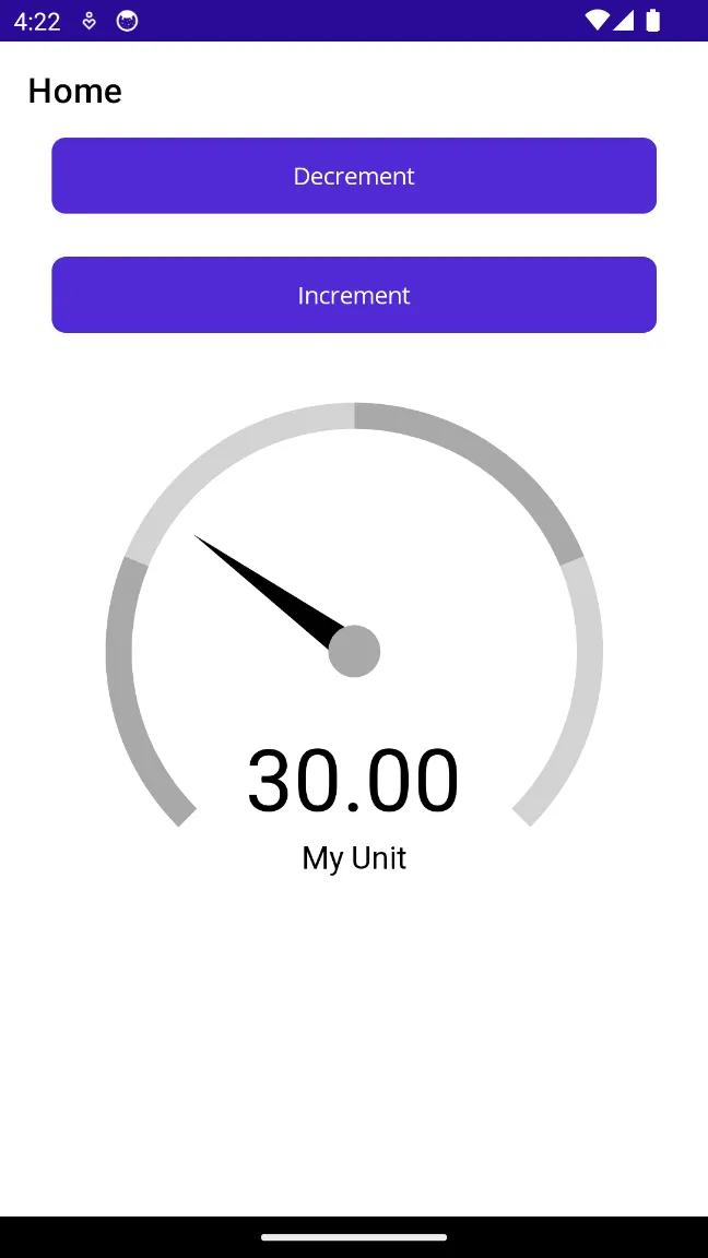
Hier ist ein Screenshot unseres Gauge-Controls, das auf einem Android-Telefon läuft. Das Control funktioniert reibungslos auf mobilen Plattformen und behält seine visuelle Integrität und Reaktionsfähigkeit bei.
Wie du gesehen hast, haben wir ein Gauge-Control mit SkiaSharp für unsere .NET MAUI-Anwendung erstellt. Du kannst den gesamten Quellcode in diesem GitHub-Repository finden. Fühle dich frei, das Repository zu forken und es zu verbessern.
Danke, dass du mitgelesen hast, und viel Spaß beim Programmieren!


Rückblick: Microsoft Build 2020
Artikel lesen
BindableProperty-Generator: Code bei Bindable Properties vereinfachen
Artikel lesen